Showing posts with label visualization. Show all posts

Thursday, December 3, 2015

Hairy Visualization Problems

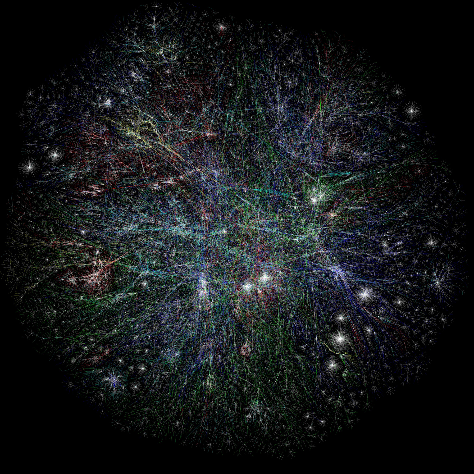
Modern data visualizations are often tours de force of artistic and graphic design. They can transcend the data and transform into artwork worthy of MoMA. These visualization often derive their visual impact for the sheer quantity of data they display. And while anyone would rather have this adorning their wall than an delimited data file, the visualization is scantily more useful for deriving useful conclusions than the underlying data file.

Mapping the Internet, by Barrett Lyon. Part of MoMA's Architecture and Design collection.
Force-directed networks, one the D3-iest of D3 layouts, often suffers this fate.  As Martin Krzywinski, who describes these visualizations as "hairballs," puts it...
The central drawback of hairball-based visualization is that they cannot be tuned to address a user's specific questions. Implicit in the hairball approach is the assumption that all questions that the user wishes to answer are addressable by the layout algorithm. When this assumption is wrong (as it usually is), the user is left to construct another hairball, based on another layout algorithm, to attempt to answer the unanswered questions. Unfortunately, the set of questions answerable by a hairball is very difficult to determine — no such list exists because of the complex interplay of data and layout.
So how do we reappropriate layout decisions to better answer questions relevant to our data?

  1. Develop a hypothesis
  2. Map the parameters of the hypothesis onto parameters governing the layout
  3. Run the layout algorithm
  4. Determine whether the hypothesis is correct

You'll notice that the common plug-and-chug method of implementing force-directed network graphs skips steps 1 and 2, which makes step 4 exceedingly hard.  Remember, absent intervention, d3.layout.force knows only about connectivity, and there's usually more to the story.  Look what the force-directed algorithm will let you do with the United States:
Force-directed layout of the United States, with initial positions seeded (source).
Force-directed layout of the United states, with alternate initial positions. Because the algorithm knows only about connectivity between the states, their relative arrangement is nonsensical. Don't let this happen to your data.


In the next post, we'll discuss how to bring some intelligence to these visualizations so that they can be used to inform, rather than simply to decorate walls.
Read More

Wednesday, November 25, 2015

Breaking free from X and Y: Why we use D3.js

At Lambda Prime, we often lean on D3.js for creating visualization of processed data regardless of whether the output will be web-based.  This choice may seem obvious given D3's ability to make stunning visualizations. But once you settle down to begin the development of a portfolio of D3-based visuals, it becomes clear that D3 is not designed as the javascript analog to the easy-to-use plotting functionality of Excel, Mathematica, or even libraries like ggplot or matplotlib.  D3 exposes every knob and expects you to set it correctly.  As Uncle Ben says, "with great power comes great responsibility," and as a D3 developer, you are responsible for every aspect of your visualization.

The host of plotting products developed on top of D3.js provide a perfect illustration of this trade-off between ease-of-implementation and flexibility in crafting output. We've reached the point where D3-based charts can be created with a wizard in Excel...that is, if you're ok sticking with the usual complement of two-axis charts.  If you eschew these reusable chart libraries and prefer diving into javascript just to plot an X-Y scatter or a bar chart, well, all the more power to you.

Libraries like dimple.js provide an easy way to create D3.js-based charts, so long as the simplicity of your dataset matches the simplicity of the tool.


What all of these D3-based products omit, however, is the ability to visualize disparate data types at will. You simply can't fire up NVD3.js or dimple.js and turn your Excel data into, for example, a network graph overlaid on a map of the United States.

D3.js enables visualizations that can include several types of data. In this case, geo-coded data, pairwise relationships, and extensive data are displayed simultaneously.


And so that's why we spend our time developing in D3. It allows us to break out of the X-Y mold of data visualization and layer on additional details that conventional charts omit  There's no wizard for it, but the investment in one-of-a-kind visualizations enables analysis that would be impossible if limited to just X and Y.
Read More